Thursday, June 2, 2016
Thursday, May 19, 2016
Advertisement Image
1.) I used my sunglasses because I use them everyday. I wanted to capture in my advertisement why i wear sunglasses.
2.) My "big idea" was to create a clear, clean, crisp, ad with very little text that got my point across and made it clear. I wanted a simple but powerful; advertisement. I feel that I achieved just that with the minimal but powerful text and the moody color and overall feel of the image.
3.) I used a gray color scheme and used defused lighting with a reflector to soften the light and get rid of reflections in the lenses.
Tuesday, May 17, 2016
Forced Perspective
1.) None of them are really believable. There are all forced perspective. If I had to pick however, I would say the last image is most believable because little toddlers have that perspective of adults all the time.
2.) The third image is the most interesting because it is the most well done image and leaves a lot open to the imagination.
3.) It was difficult getting ideas for some of the images. Also, getting the shot to work was sometimes difficult.
Wednesday, May 11, 2016
Monday, May 9, 2016
Thursday, May 5, 2016
Still Life Photography
1.) The boot represents how humanity is grounded t the earth. The plane coming out of the boot represents humans need and want to fly even though we can't natural. The apple represents sustenance the human needs in order to fly. The apple in the second image represents temptation (the apple adam and eve bit out of). The candle represents harm under the temptation. If you go after the apple you will get hurt.
2.) We used both direct and defused lighting. The direct lighting however, is more prominent.
3.) Our first image could be sharper, clearer, and more focused. We could have a better background.
Friday, April 29, 2016
Thursday, April 21, 2016
Tuesday, April 19, 2016
Friday, April 15, 2016
Thursday, March 31, 2016
Green Screen Project--Period 2
2.) I like the depth of the composition and the texture.
3.) I could find a way to blend the subject matter more efficiently with the background.
Monday, March 21, 2016
Thursday, March 10, 2016
Wednesday, March 2, 2016
Monday, February 29, 2016
Speed Challenge Quiz
1.) The lighting, texture, and clear focus on the subject matter.
2.) The texture and focus of the image.
3.) Just used a filter off of snapchat.
4.) I had to find something that stood out in a school campus. I wanted to find something that most people would take for granted and not really even notice.
5.) Rule of thirds, texture and shape.
Wednesday, February 17, 2016
Monday, February 8, 2016
Landscape Project
1.) For the fist image I used the rule of thirds. I emphasized the sky against the tree branches.
2.) The principles of colors that I used are color and balance. I balanced the the main subject matter and put different amount of space between it. I also captured nice colors especially in the last image with the sunlight against the green bush. The middle image has texture to the background.
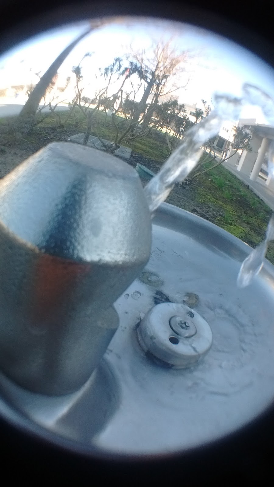
3.) The image was shot around 9:00 am. I found that this was a great time to shoot because the lighting was soft and yellow.
4.) I used the foreground to lead into my subject matter in my second image. I used the natural plain background in my first image in contrast of my subject mater.
1.) The mixer channel produced the best results.
2.) I achieved a large value range in saturation and channel mixer.
Subscribe to:
Posts (Atom)